conic-gradient是 CSS 中用于创建锥形渐变效果的函数。与线性渐变(linear-gradient)和径向渐变(radial-gradient)不同,conic-gradient 是 CSS 中一种围绕中心点按角度方向渐变的颜色过渡效果,就像一个色轮一样。颜色从起始角度开始,沿顺时针方向环绕中心分布。
语法
-
起始角度:可选,默认
0deg(12 点钟方向),如from 90deg表示从 3 点钟方向开始。 -
中心点位置:可选,默认
at center,如at 20% 80%定义渐变的中心点。 -
颜色断点:颜色值 + 位置(百分比或角度),如
red 0%, blue 30%。
background: conic-gradient( [from <起始角度>] [at <中心点位置>], <颜色断点1> [<位置>], <颜色断点2> [<位置>], ... ); /*例如*/ /* 简单的三色锥形渐变 */ .element { background: conic-gradient(red, yellow, blue); } /* 指定起始角度和中心点的锥形渐变 */ .element2 { background: conic-gradient(from 45deg at 20% 30%, red, yellow, blue); }
通过conic-gradient属性可以实现很多复杂且好看的效果,比如常见的加载指示器、饼图、色轮、透明网格背景效果等。
加载指示器
可以根据不同的配置,生成各种加载效果
1.简单的加载效果
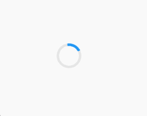
.loader {
    width: 50px;
    height: 50px;
    border-radius: 50%;
    background: conic-gradient(#e5e5e5 0% 80%, #2196f3 80%);
    mask: radial-gradient(transparent 55%, #000 56%);
    /* 挖空中心 */
    animation: rotate 1s linear infinite;
}
@keyframes rotate {
    to {
        transform: rotate(360deg);
   }
}
2.渐变偏移动画

.loader-offset {
    width: 60px;
    height: 60px;
    border-radius: 50%;
    background:
        conic-gradient(#ff4757, #ffa502, #2ed573, #1e90ff, #ff4757);
    mask: radial-gradient(transparent 50%, #000 61%);
    animation:
        rotate 1.5s linear infinite,
        bgShift 3s linear infinite;
}
@keyframes bgShift {
    to {
        background-position: 400% 0;
   }
}
3.离散的圆点围绕环形加载

 .loader-dots {
  width: 40px;
  height: 40px;
  background:
    conic-gradient(
      #3498db 0% 10%,
      transparent 10% 20%,
      #3498db 20% 30%,
      transparent 30% 40%,
      #3498db 40% 50%,
      transparent 50% 60%,
      #3498db 60% 70%,
      transparent 70% 80%,
      #3498db 80% 90%,
      transparent 90%
   );
  animation: rotate 1s linear infinite;
}
网格背景
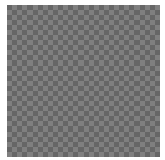
 .checkerboard {
  width: 200px;
  height: 200px;
  background: conic-gradient(#eee 25%, #444 0% 50%, #eee 0% 75%, #444 0%);
  background-size: 20px 20px;
}
通过 background-size 平铺锥形渐变,利用硬边断点创建方格。
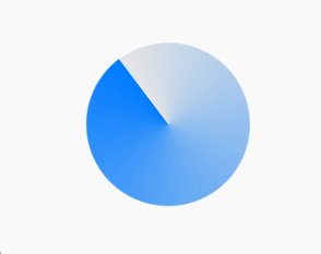
饼图(Pie Chart)
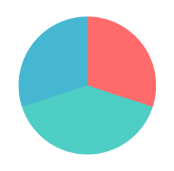
.pie-chart {
  width: 200px;
  height: 200px;
  border-radius: 50%;
  background: conic-gradient(
    #ff6b6b 0% 30%,
    #4ecdc4 30% 70%,
    #45b7d1 70% 100%
 );
}
生成三色饼图,颜色分界线清晰。颜色断点使用相同起止位置(如 30%)实现硬边。
色轮
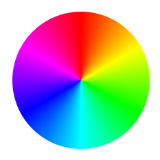
.color-wheel {
  width: 200px;
  height: 200px;
  border-radius: 50%;
  background: conic-gradient(
    hsl(0, 100%, 50%),
    hsl(60, 100%, 50%),
    hsl(120, 100%, 50%),
    hsl(180, 100%, 50%),
    hsl(240, 100%, 50%),
    hsl(300, 100%, 50%),
    hsl(360, 100%, 50%)
 );
}
配合 hsl() 函数实现色相自然过渡。
渐变按钮
 .glow-button {
  width: 100px;
  height: 100px;
  border-radius: 50%;
  background: conic-gradient(
    from 180deg,
    #ff8a00,
    #e52e71,
    #00f2fe,
    #4facfe,
    #ff8a00
 );
}
拓展 repaeting-conic-gradient
repeating-conic-gradient与 conic-gradient 类似,但颜色断点会无限重复,直到填充满整个区域。
条纹背景
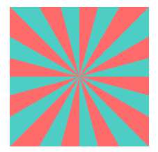
每 30deg 重复一次红蓝条纹(15°红色 + 15°蓝色)
 .stripes {
  width: 200px;
  height: 200px;
  background: repeating-conic-gradient(
    #ff6b6b 0deg 15deg,
    #4ecdc4 15deg 30deg
 );
}
